The Australian/Canadian hybrid blog Desire to Inspire is one of my favorite sources for dependable, daily inspiration.
(Jo and Kim do take Sundays off.) DTI celebrates design front and center, sometimes minimal, sometimes maximal. I can never make up my mind on minimal/maximal either.
Except where plants are concerned; more is definitely more. But I fully understand not everyone shares that plant-centric point of view. And sometimes space just won’t permit.
Earlier in the week Jo posted just such a case study from the portfolio of Australian garden design firm Adam Robinson Design.
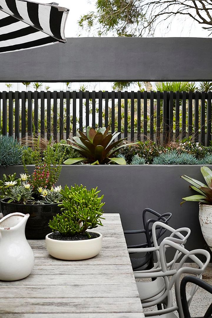
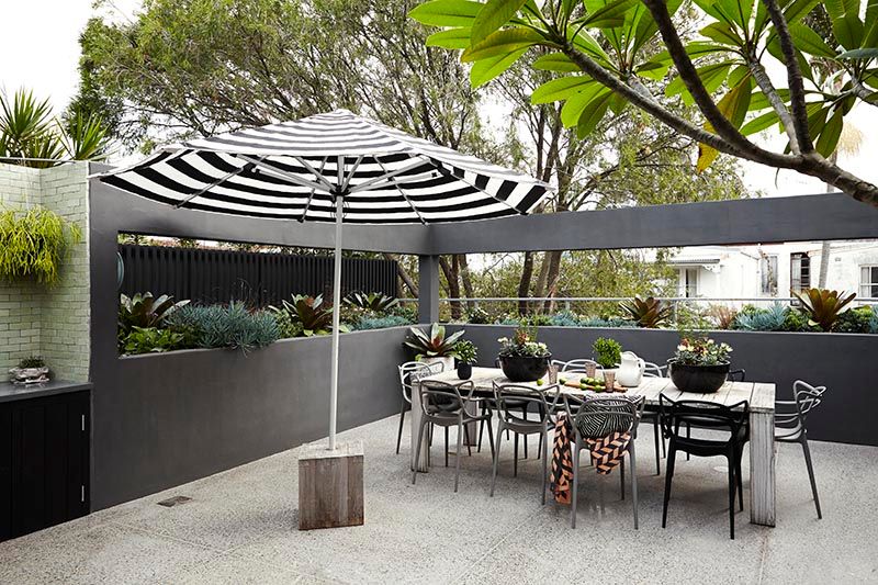
A serenely austere, monochromatic treatment for a Sydney balcony, with lots of good ideas to crib for small gardens. That wood block as anchor for a large umbrella, for example.
And the built-in planter/privacy wall planted with bromeliads and succulents. Alternating wooden slats and cutouts balance privacy with claustrophobia.


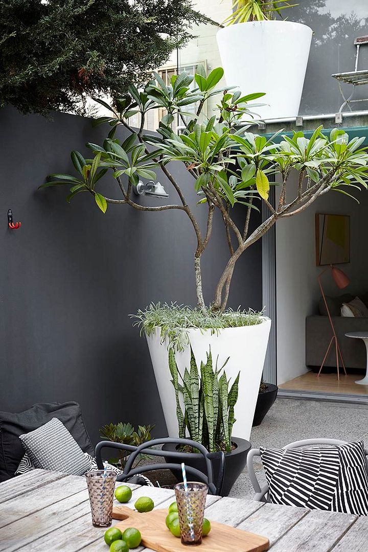
I’ve never seen a plumeria displayed to greater advantage than in that large conical planter, which makes a virtue of its open, gawky structure.
Just imagine how the balcony walls trap and hold that scent on a warm summer evening. At least it looks like a plumeria to me..

More from Adam Robinson Design’s portfolio can be found here.

Wait! No mention of chair porn?!
If I had a covered balcony in this Canadian climate, it would look something like this with even more plants. I share your sentiment completely…where plants are concerned; more is definitely more. 🙂