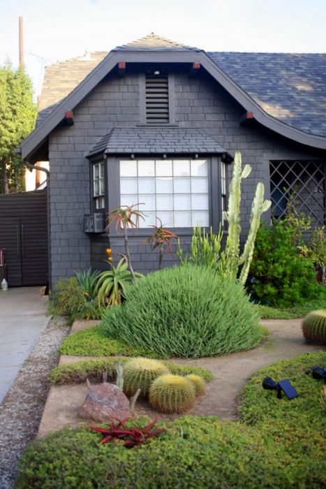
There I was, biking through French chateau country, rounding a bend in the zig-zag roads stitched with Lombardy poplars. And just as I was brushing the wind-blown hair out of my face, doing my best impersonation of Jeanne Moreau in Jules and Jim, the improbable sight of a sculptural succulent garden, and not the traditional parterre befitting a country house, had me hitting the brakes hard.
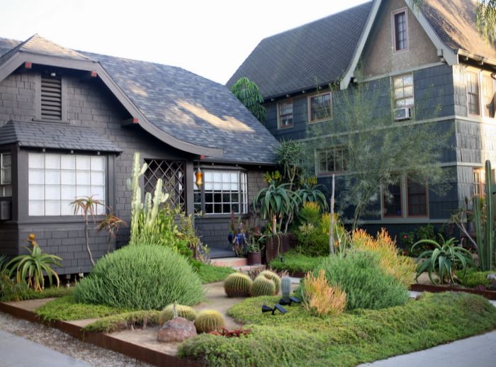
Ha! Nice daydream, right? But no, I’m out of air points at the moment. The “countryside” in this case was the bike corridor of 3rd Street, my go-to, east-west axis through Long Beach, so I’m seeing a lot of this garden lately. And there is an undeniable movie-set vibe to the little street. It’s just off 3rd at Lowena Drive, aka the local French chateau country. Mr. Lowe, a flower grower on a farm in this very spot back in the 1900s, built a group of four chateauesque dwellings from 1919 to 1926 on this street that now bears his name along with historically protected status.
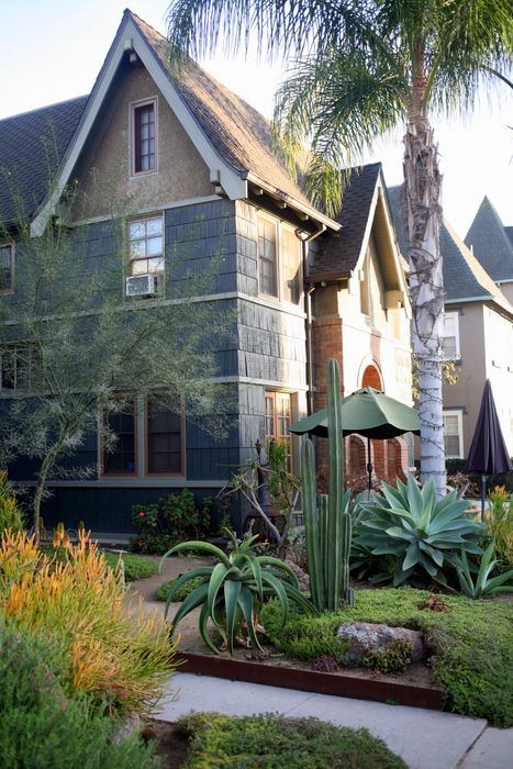
The entire street, and especially this little garden, brings a smile every time I bike past. Mr. Lowe was obviously a big-time daydreamer too. There’s not much biographical information available on him, so I have no clue as to why he fixated on this architectural style. The surname “Lowe” could be English, French, German, etc., etc.
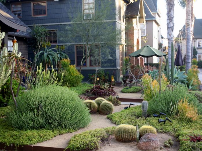
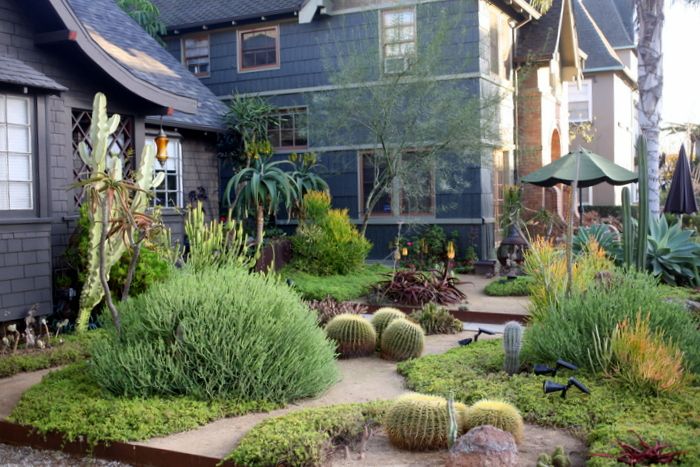
I love how the garden is shared with the neighboring property and visually flows down the street like a mini resort. I’m not sure which house fires up that iron chimnea near the property line — possibly it’s communal. This photo is looking south, with the ocean about a quarter mile away. (Our beaches face south, not west.) The umbrellas belong to the adjacent third-story property, which doesn’t have the depth for a front garden of its own, just some containers and small sitting areas.
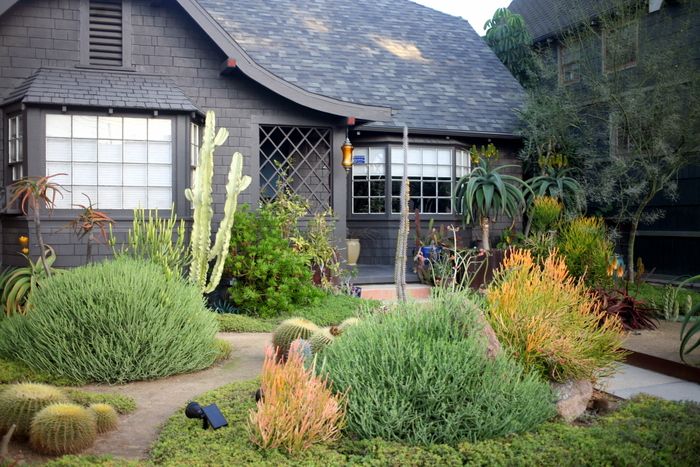
I Instagram’d this house back in early December and have been plotting to make it back with the big camera for blog photos ever since. Nice timing now that the aloes are in bloom.
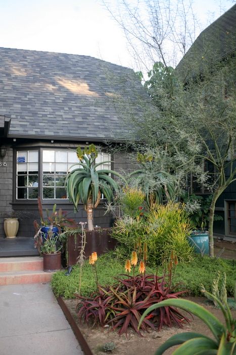
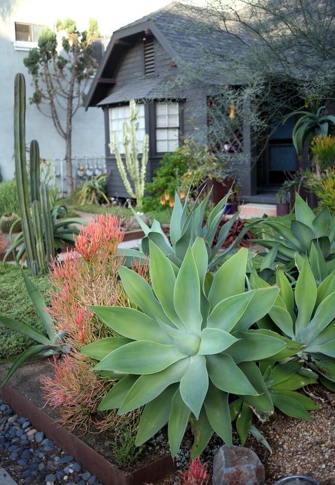
The house faces west, so the garden gets loads of sun. The tree aloes in bloom by the front porch may be Aloe thraskii. Uncertain identity of the foreground aloe with peachy torches and deep red leaves. Barely perceptible to the right of that aloe is a young Totem Pole cactus, Lophocereus schottii, in its monstrose form.
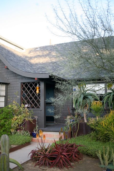
The simple planting is mainly composed of aloes, several species of euphorbias, and a few species of cactus, especially the repetitive use of the strong shapes of barrel cactus. The sole tree, a palo verde, leans in from the right side of this photo.
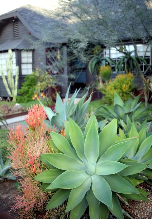
The only agave included is A. attenuata near the sidewalk.
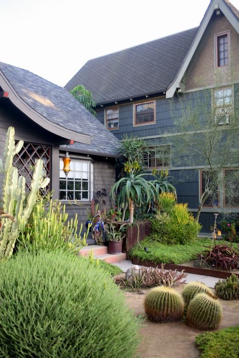
The garden is edged with Cor-Ten, and it appears that the tree aloes near the porch may be growing in Cor-Ten planters as well. Note the schefflera just peeking over the hip roof.
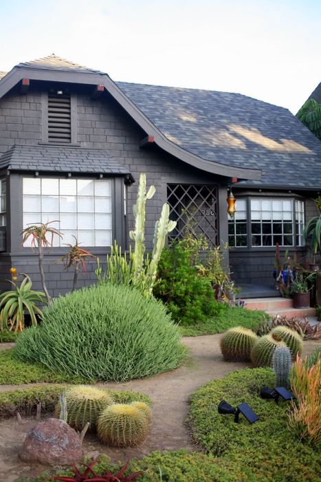
The meandering decomposed granite paths are a surprising choice over a formal grid of paths with hard right angles, which is usually the preference where a strong pattern is wanted. And yet an organic strength from the design is achieved nonetheless, abstract and sinuous, resulting in no plant being “walled off” but able to be seen from many vantage points. I love the effect of how the paths seem to flow like water through the plantings and also function as strong negative space that brings the statuesque plants into sculptural relief. The low ground cover, possibly an ice plant like red apple or something vigorous with small leaves like oscularia, is kept tightly trimmed to preserve the shapes of plants and paths.
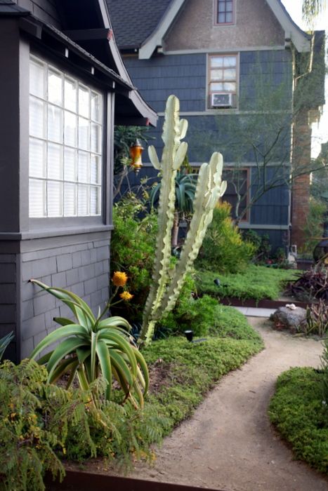
Though somewhat abstract, the paths do follow a practical layout. These photos were taken about a day after our first rainstorm, which this little absorptive garden handled beautifully.
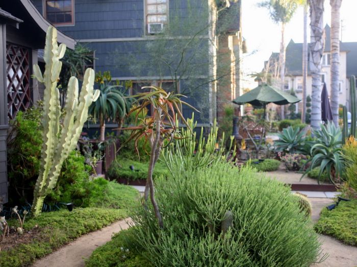
Note the cactus swallowed by a pencilbush, a sign of the invisible hand guiding the garden, picking winners and losers. I read this as the cactus being forfeited to allow the lush, rotund shape of Euphorbia mauritanica full expression, but that’s just my take. But it does make you wonder how much of the garden was planned versus evolved as the plants matured and shapes grew stronger.
Succulent gardens easily come to mind for architectural styles such as Mid Century Modern, Spanish Revival. I think this little front garden is proof that a succulent garden can accommodate any style home.

I like this! It is so green. Too often we see succulent plants with gravel ground covers. The green plant ground cover is so refreshing. It only takes minimal water, too. This was a very nice post, Denise, thank you.
You know, I think the paint color of the house really helps inform the succulent design –imagine if the house were pastel yellow for instance or even a light gray like mine. I don’t think it would be quite the same. With the dark background the plants become the focal point.
Sweet little garden!
:: proof that a succulent garden can accommodate any style home. ::
Bold words, and a fun design challenge! There’s not a lot of the Greek Revival style out there where succulents make sense, but it’s a good example of a tough case because it almost demands symmetry. I’m seeing barrel cacti at the front edge of the garden, lined up with the house’s columns on either side of the straight front walk. Together with a pair of suitably scaled containers flanking the front steps, they might make enough of a nod to the house to allow the planting between to be informal.
Your intro sucked me in at first – I thought you’d been off gadding about on an international holiday again. Wonderful garden! I’ve been thinking I need to explore the areas outside my own immediate neighborhood but in this area walking around shooting photos of houses can prompt a call to the sheriff’s department ;(
Ks is definitely onto something with the point about the dark color of the houses. One of the most appealing elements in this very appealing garden is the laciness of the palo verde canopy, which might be almost invisible against lighter walls.
There’s a lot of wonderful “occult balance” going on here. Yum!
Oh my. It’s almost unfair for a person to be this adept at maintaining such a beautiful building’s character AND cultivating a wonderful garden.
The palette of the latter is definitely incongruous with the period of the former, but I’ve never been a purist about such things, personally. After all, why not take advantage of the climate?
I imagine it’ll soon exit vogue, but, as ks and Nell mention, I really like seeing that the enthusiasm for darker exterior shades have finally made a dent on our collective psyche this far south. Really suits the buildings’s lines and provides a perfect backdrop for the garden, noticeably tasteful but not in competition with it. The use of Cor-Ten is also masterful. I didn’t notice it immediately because it wasn’t obnoxiously announcing itself. And, as you say, the garden has the mark of someone who knows what they’re doing and what they personally want in the present tense, rather than a designer whose vision hasn’t been compromised or tweaked by anything so messy as real life.
Also, thank you for pointing out that you have an instagram account. I didn’t know of it, but if ever there was a plant enthusiast and photographer that ought to have one, it’s you.
@Jane, yes, so green! That is a very good point, because succulent gardens can indulge in greys, blues, yellows, and yet this one chose mostly a restful green, with the accents of the sticks on fire. I’ve got to remember to return to catch the lime green bloom on the Euph. mauritanica in spring, and get a closer look on the ground cover.
@Kathy, the paint color is a huge contributor, not to mention the adjacent properties in the same color scheme. Our own house was a very dark brown at one time, which I loved, but it oxidized badly in the strong sun and was very, very hot. We always use Benjamin Moore paint, so it wasn’t cheap paint. But I still love this dark look.
@Nell, just when you think something demands symmetry, bam! — occult balance wins! And thanks for introducing me to that phrase for asymmetry.
@Kris, luckily this is a busy street, and these houses draw lots of attention, so a camera isn’t a big deal.
@Saurs, there’s a big enthusiasm for dark paint shades now, so much so that up in San Francisco the Victorian Painted Ladies have been going dark when new paint is required — much cheaper than tricking them out in several colors, and there’s a bit of a backlash from the purists. I agree about how the Cor-Ten is subtly deployed — I didn’t even seen the Cor-Ten planters until preparing this post. Here’s my Instagram: https://www.instagram.com/botanizeme/ — up in the header under “follow”
@David, it’s an unusual combination of plant savvy choices and restraint. The GC does involve a bit more maintenance keeping in bounds, but no more than a small lawn 😉
Wm. Frederick’s book The Exuberant Garden and the Controlling Hand (1992) introduced me to occult balance. Because he used the term early in the book without explaining it, I figured it was something that gets taught in landscape architecture studies (his training). Although he never uses the words again, what follows is a clear discussion of how to use plants with different forms to achieve that kind of balance in a space.
Re-reading the book over the holidays brought the concept back to mind. The bitterness of this winter so far, world and weather, has sent me back through the shelf of my “keeper” books on garden design, focusing on the ones I haven’t looked at in a while. The idea was to pare down a bit, but most of them have been unexpectedly rewarding: I’m such a different gardener now than when I first encountered these books.
Definitely a winner. Both house colors serve to highlight the plants as well.