“Beautifully restored craftsman set in low maintenance and low water ‘Sonoma’ style gardens. Garden design by owner Craig Boelson”
This bungalow, which the owner described as slated for demolition when he took over the property, had lots of things to say to fellow bungalow owners like me. Chiefly what it exemplified was the power of restraint joined with simple, sure-handed taste. No lawn at all, neither in the front garden nor back, the ground surfaced in gravel or dry-laid repurposed bricks that came with the property when the owner acquired it. The house’s dark chocolate-colored paint and white trim set the basic tones used throughout the house and garden, building up a sustained mood both rich and light. The deep, wraparound front porch is rimmed in the front garden with succulents and Agave attenuata, with small trees and gravel deployed where traditionally lawn would be maintained. This was the definitive anti-compulsory maintenance house and garden.
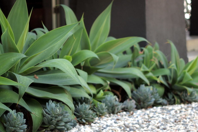
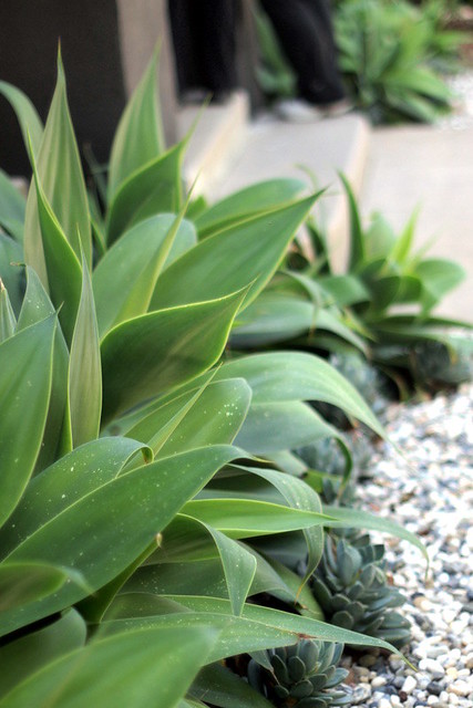
View of the side, L-portion of the wraparound porch.
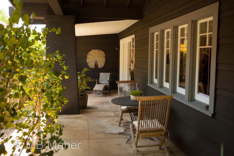
Throughout its length on two sides of the house the porch has room enough for several groupings of chairs.
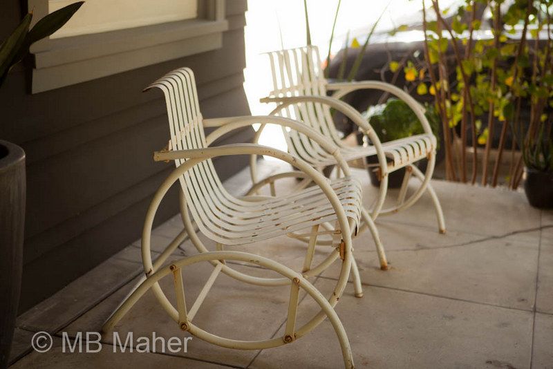
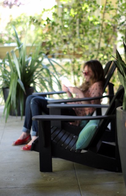
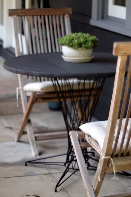
Colorful concrete was unveiled when carpeting was ripped up and this formerly closed-in room was added back to the porch.
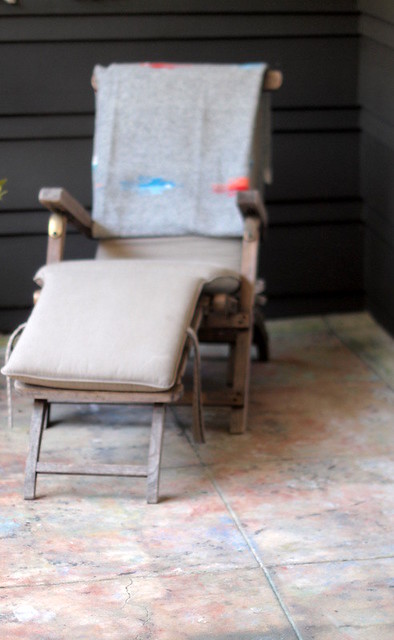
No clutter, very few pots. How do people manage such restraint?
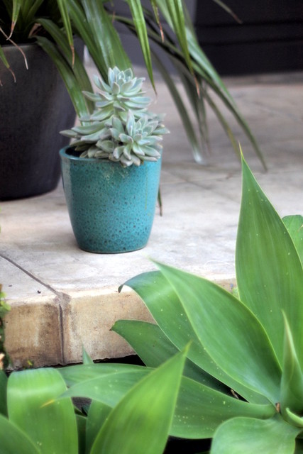
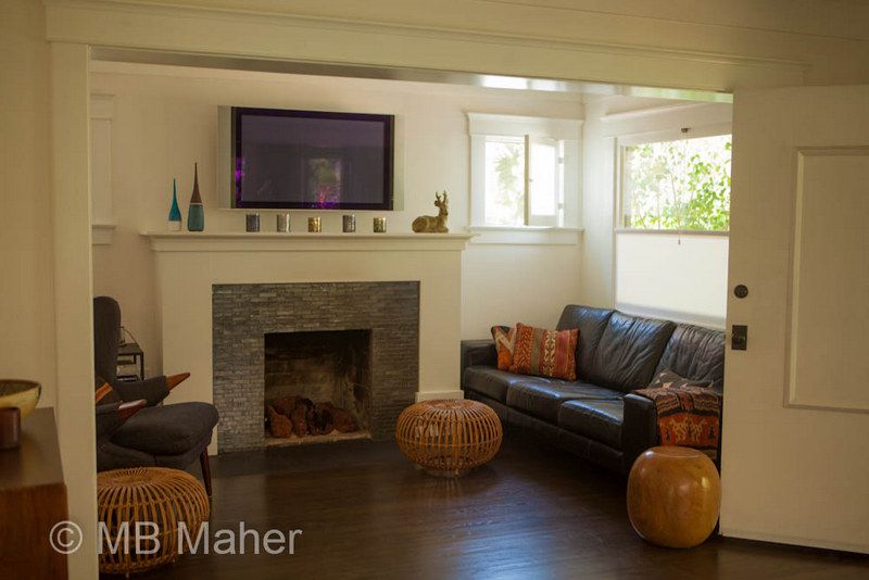
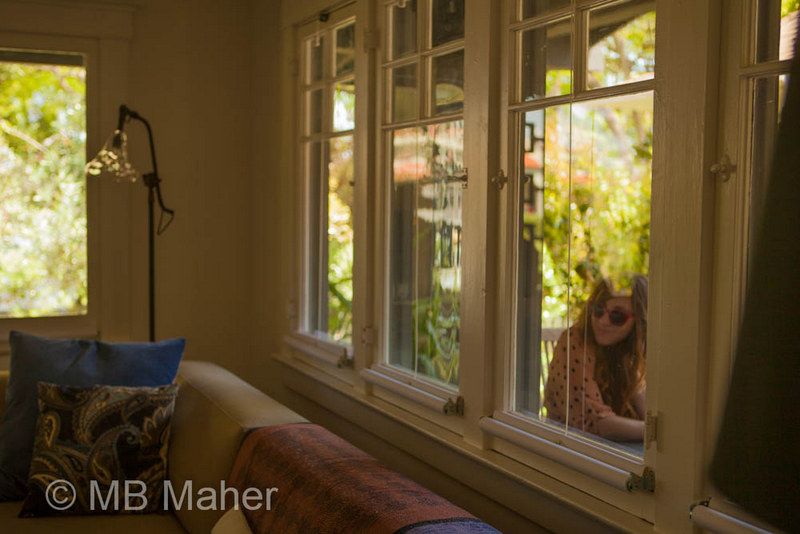
For a bungalow, the house managed to be amazingly light and airy. Bungalows in general can be dark, some might say gloomy, and this one’s deep, wraparound porch would tend to inhibit light from penetrating under the low-slung eaves.
Probably the reason the interior was painted white, both walls and trim. Top-down window shades maximize light too.
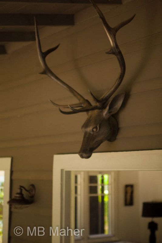
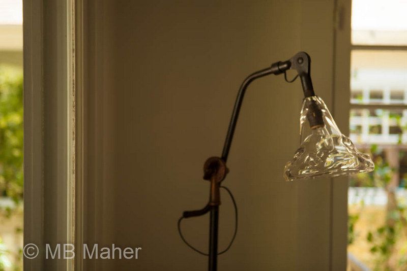
Through the kitchen to the back garden. The kitchen wasn’t “done” yet, but I personally wouldn’t change a thing.
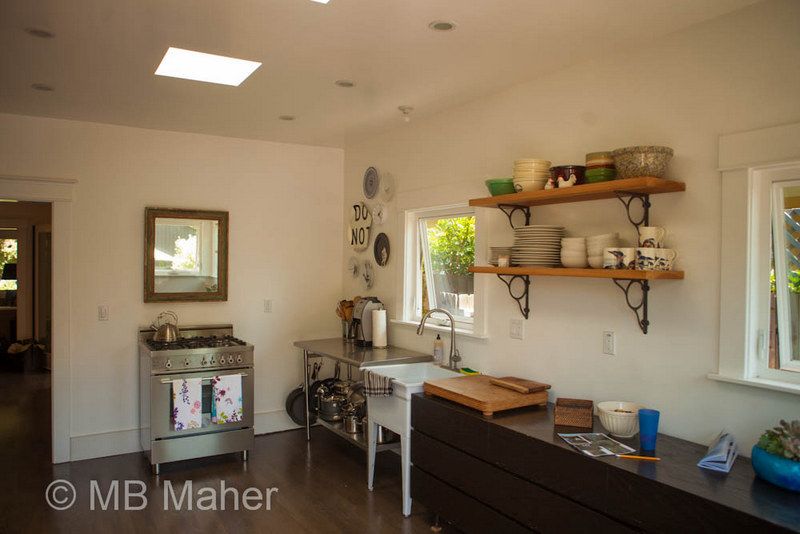
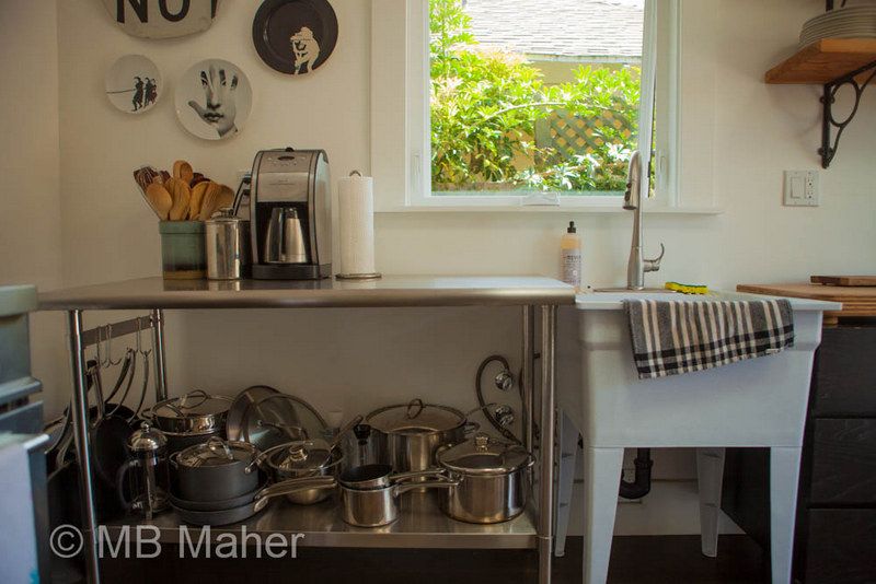
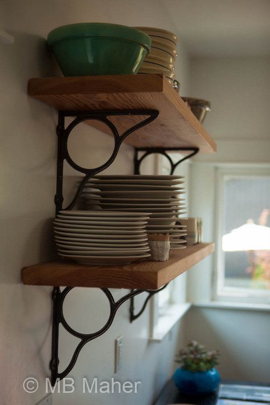

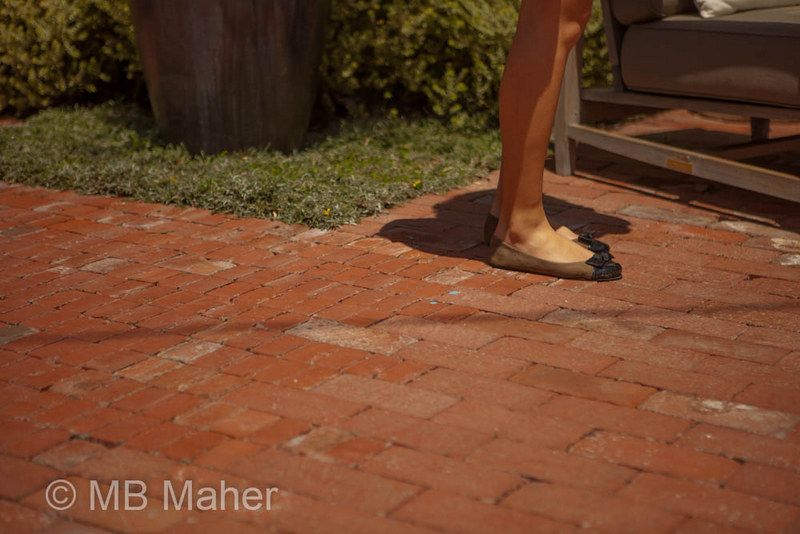
Out the kitchen door and into the back garden. The owner reset the dry-laid bricks and cleverly set broken ones on end, which had an energizing effect on the pattern, using this technique to great effect to signal transition areas. Great remedy for what can be a boring expanse of brickwork.
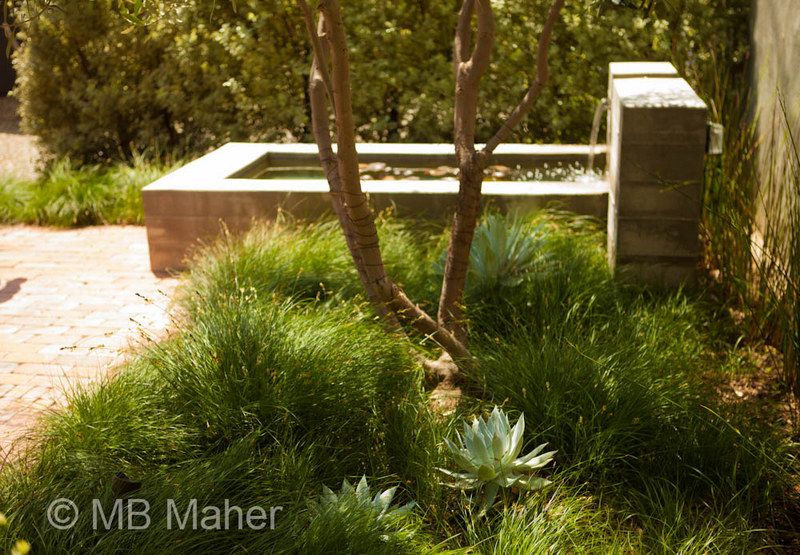
Concrete pool and fountain against a boundary wall
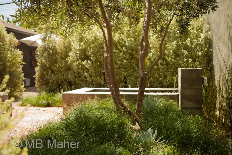
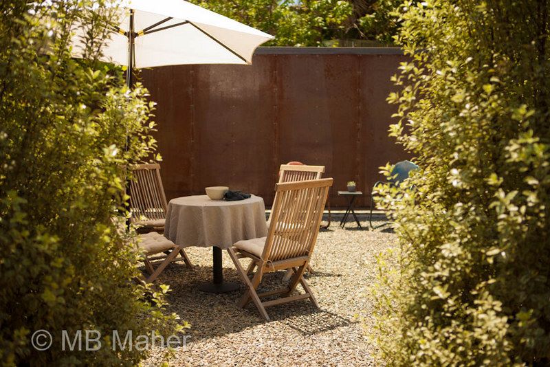
With a glimpse of another seating area at the far end of the property, this one graveled over and semi-screened by shrubs.
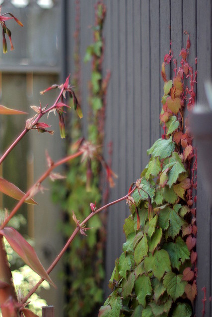
The planting was austere but well-chosen. Beschorneria leaning into the wall-tracery of parthenocissus.
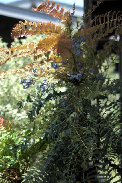
Beautiful mature mahonia.
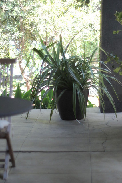
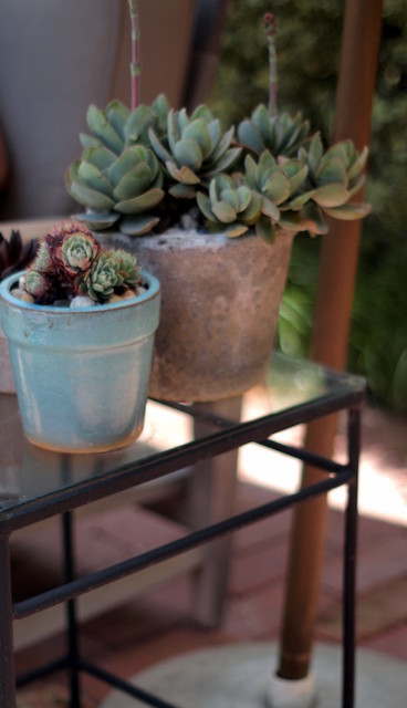
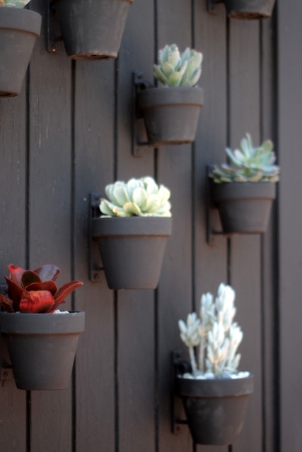
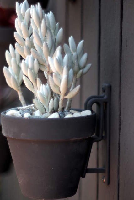
Another example of the steely discipline the owner employed. Chocolate-painted pots against a chocolate background.
So much of this house was familiar. Our house was formerly this dark chocolate color. Bricks and gravel for surfacing, check and check. Inventory of chairs, including an old steamer chair, check. But restraint — now there’s an unfamiliar concept.
Photos not bearing photographer MB Maher’s watermark were taken by me

We have the same kind of “open garden tour” (but not available for the house, only gardens).
It takes place every firt week-end of june, all over France.
Come with Mitch !
They certainly make restraint look good!
Delphine, if it was only the price of a tour ticket and not the airfare too, I’d be there!
Loree, I so agree. This guy made such smart choices for this house. I didn’t really see any properties on this tour inhabited by plant-obsessed types. I daily crave lots more varied kinds of plants around me, which is an admitted design weakness. And that’s your new house color too!
But you didn’t look in the garage? Might have been stuffed with plants. Or should have been. 🙂