Southern California’s Spring Garden Show started yesterday, 4/23/15, and continues through Sunday, 4/26/15.
It’s always held in the enclosed “Home Store Wing” of the South Coast Plaza.
This wing includes, among many other stores, Anthropologie, West Elm, Z Gallerie, Crate and Barrel, Pottery Barn, Restoration Hardware — you know them by their envy-inducing catalogues.
Scuttlebutt at the show today suggested that these stores, while appreciating the customers the show has historically driven to their doors, decided this year to thin that plant-mad traffic out a bit.
Fewer plant vendors were allowed to participate so there would be more breathing room around the stores.
In another twist, the stores partnered with local designers to create the show gardens.
How did it all pan out? Judge for yourself.
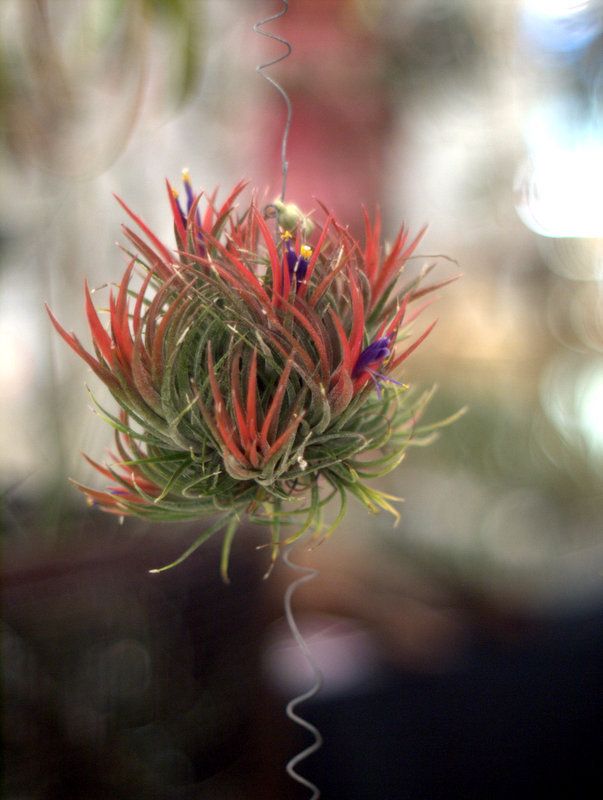
And, relax, of course there were still tillandsias! There just weren’t multiple vendors with tillandsias. Redundancy was verboten this year.
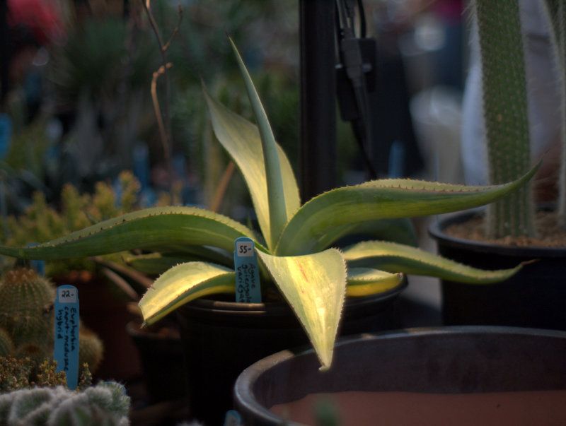
And there was still a sexy agave or two (Agave guiengola ‘Striata’)
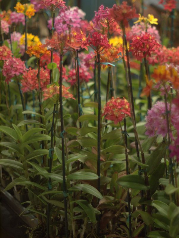
Orchid lovers still had lots to ogle. The epidendrums, or reed orchids, never miss a show.
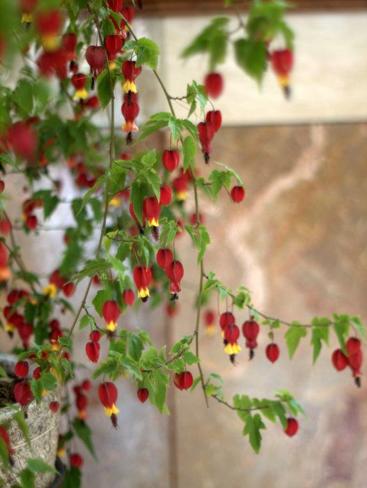
A very lush and happy Abutilon megapotamicum grown on standard was in attendance.
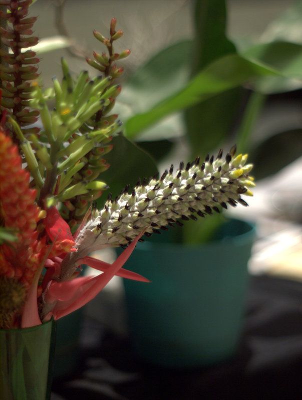
As were a few bromeliad tables. This vendor had their flowers cut for a bouquet.
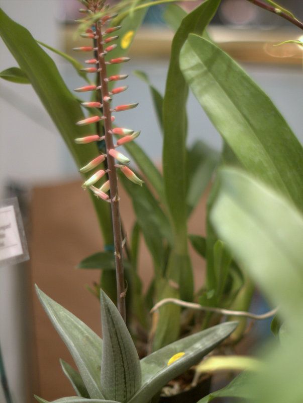
Succulents were fairly well represented. I’m always surprised at how beautiful a gasteria is in bloom.
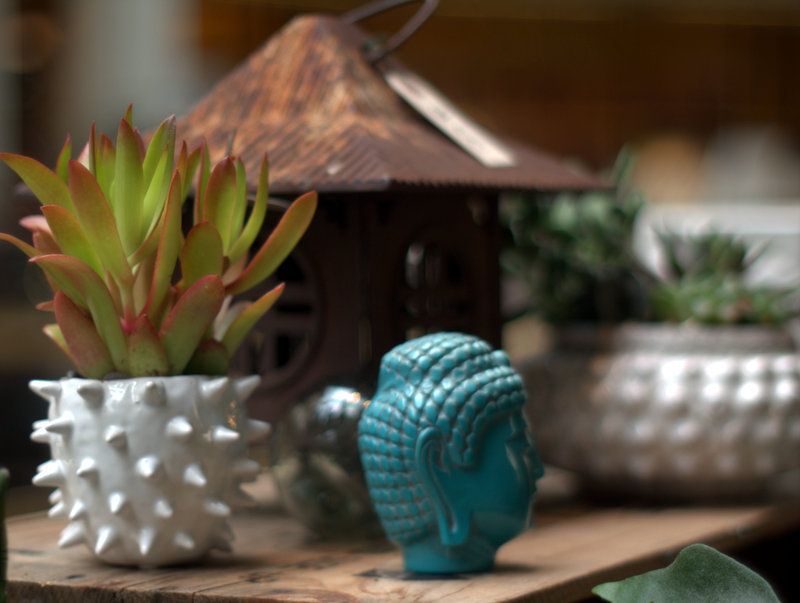
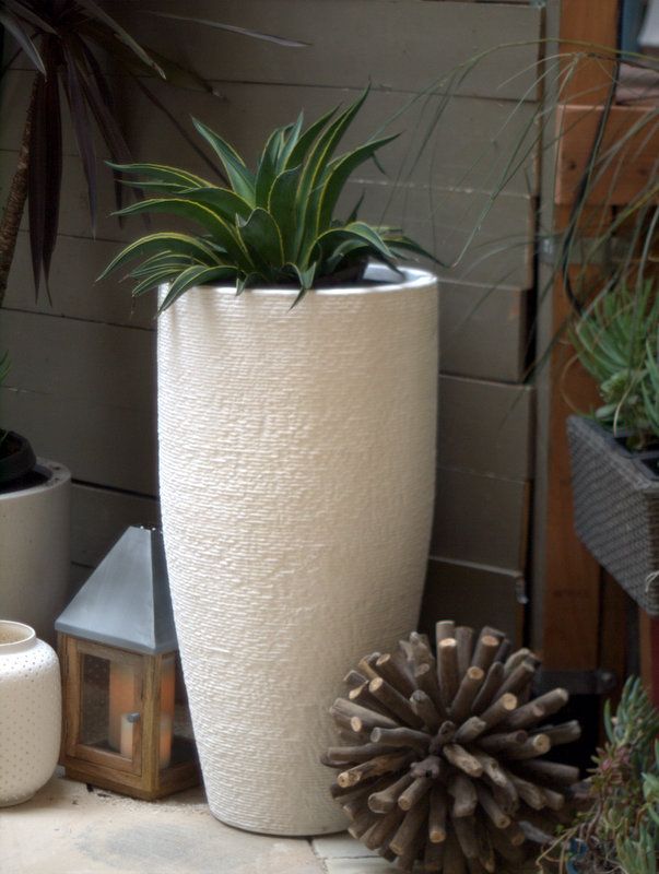
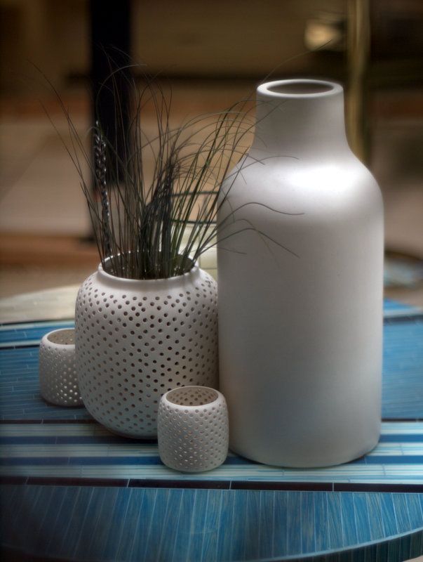
Pottery
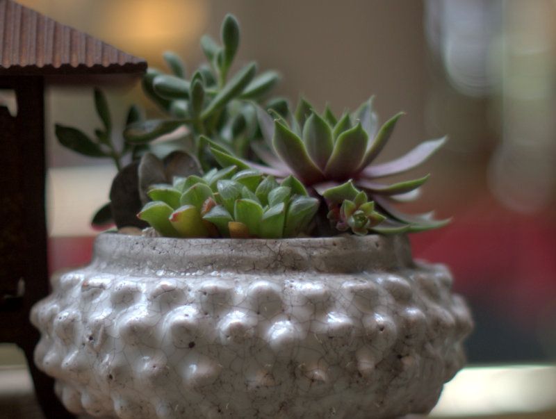
But where were the really cool plants, the juicy show stuff?
I was on the prowl for the Flame Pea, Chorizema cordatum, which I had just seen at the Disney Concert Hall garden yesterday.
Up and down escalators to three floors, and no Flame Pea. Fine, I’ll just head over to the B&D Lilies table…okay, maybe not this year.
Admittedly, I was a bit let down at first at the reduced number of plant vendors.
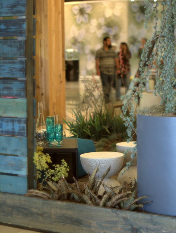
So I headed over to Dustin Gimbel’s collaboration with Crate and Barrel and immediately cheered up.
So much of what I see in his own garden and shapes he’s been mulling over in his work came through in this display…if not my photos.
People, these are plant show photos, weird light, funny angles, arms and legs blocking shots, etc.
That’s a tiny glimpse of a majestic, over 10-foot Cedrus atlantica ‘Glauca Pendula’ on the right.
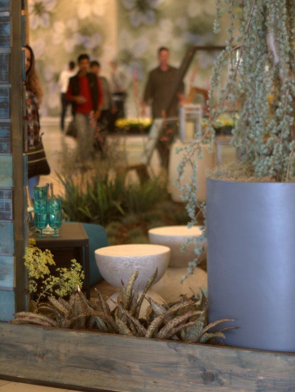
I loved people-watching through this view
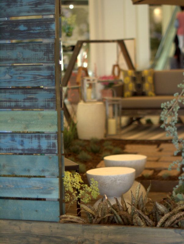
More of that blue/green screen, carefully sanded to let paint and wood bleed into each other.
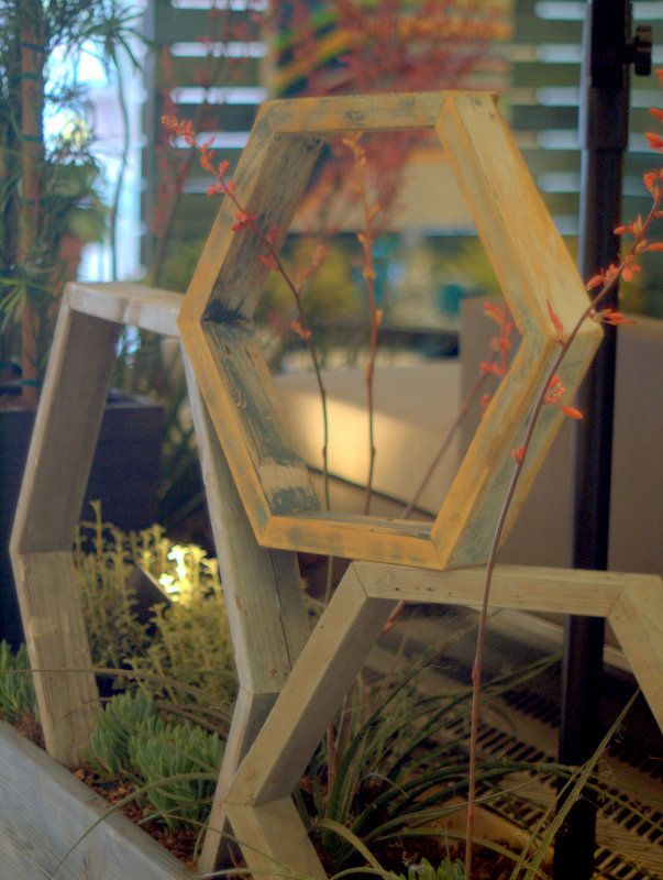
Like stories within stories, Dustin always plays with visual framing devices.
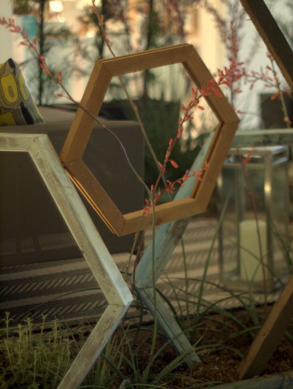
Wands of hesperaloe weave through the octogon frames, some of which looked off kilter and precariously balanced.
Just another trick of the eye. All were sturdily fixed in place.
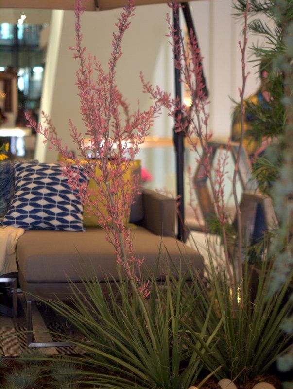
A hesperaloe to keep an eye out for, with heavily textured leaves and frothy blooms, ‘Pink Parade.’
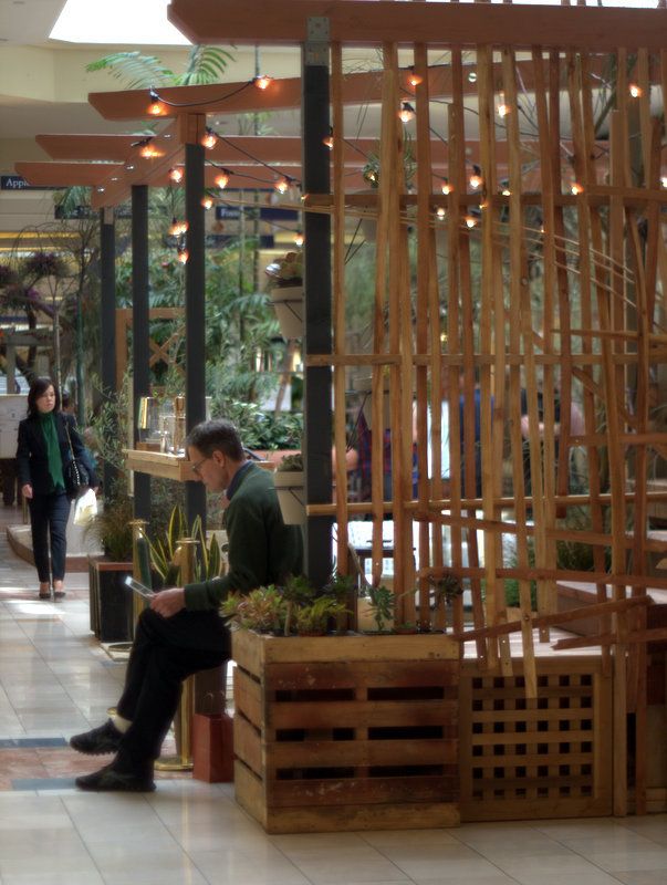
Land Workshop’s collaboration with West Elm.
By and large, the designers all used simple materials, clean shapes.
And studying the materials used to build the displays was a crash course in effective screens and fencing sourced straight from the hardware store.
The corner is formed by pallets on end, the open top used as a planter.
The slapdash screening woven with wooden slats reminded me a bit of Stephen Glassman’s work with bamboo.
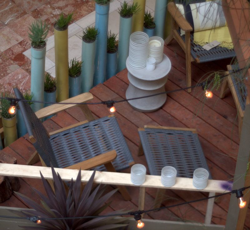
Behind the gentleman was a short flight of stairs leading to a small sitting area
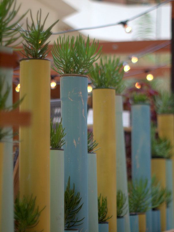
A screen of aluminum pipes, painted in pastel shades, planted with Senecio vitalis.
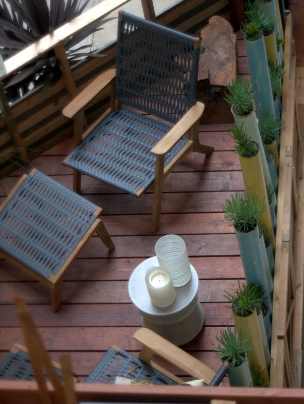
Another crazy angled overhead shot to show how this small area fit together.
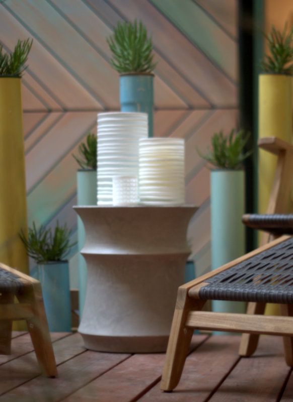
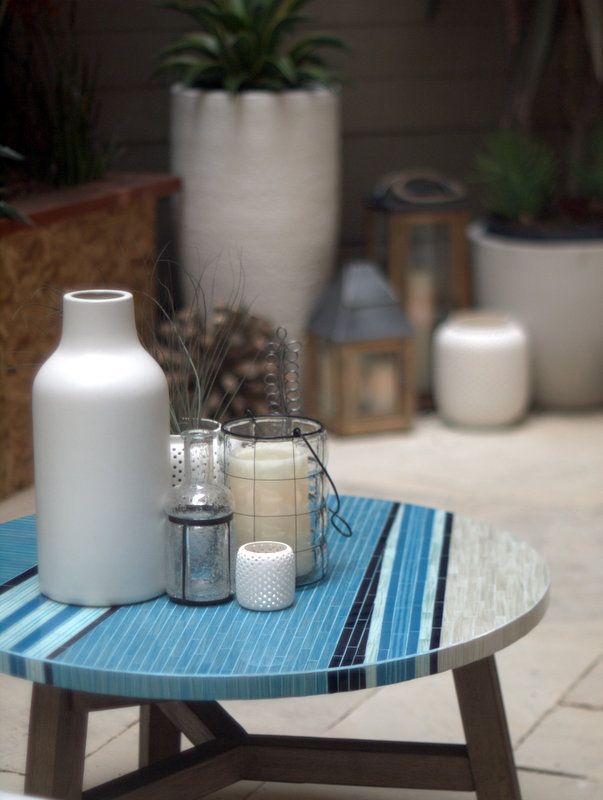
At ground level was a sweet mosaic table, potted plants, and a raised bar/dining area out of frame
This display garden was opposite the Apple store, and foot traffic was very heavy around the perimeter.
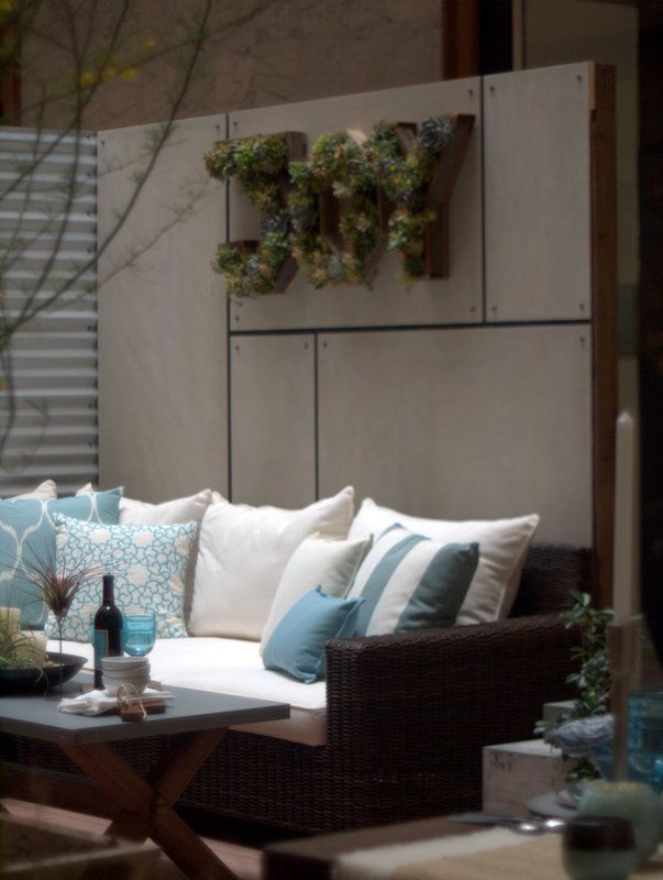
Another display I liked was designer Camille Beehler’s collaboration with Pottery Barn.
I was particularly interested in the walls, the puzzle-fitted cement backer boards behind the couches for one wall, corrugated siding for another.
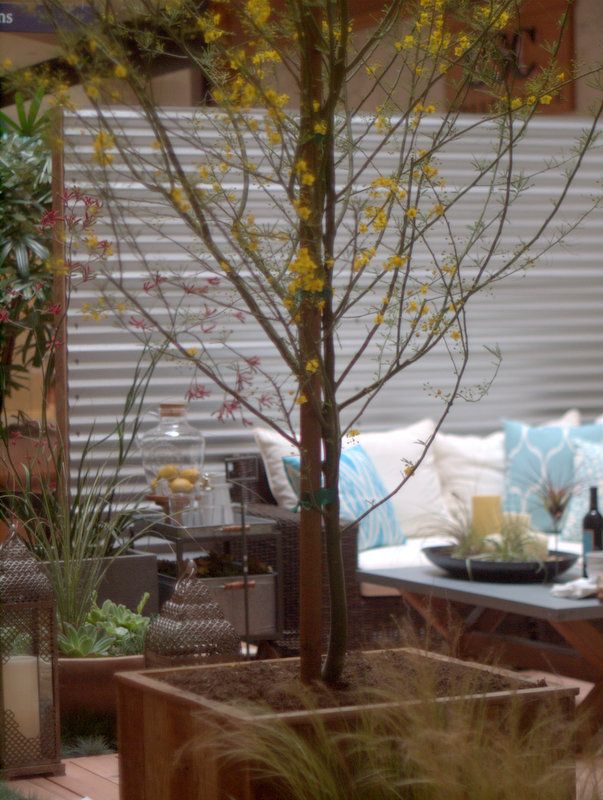
Potted palo verde tree, couches, bar cart, corrugated screen
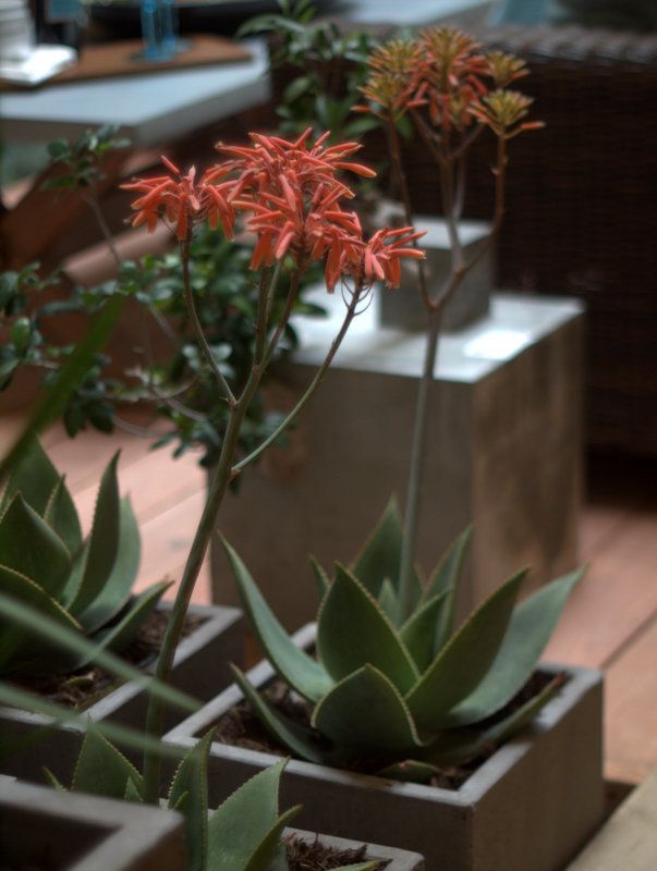
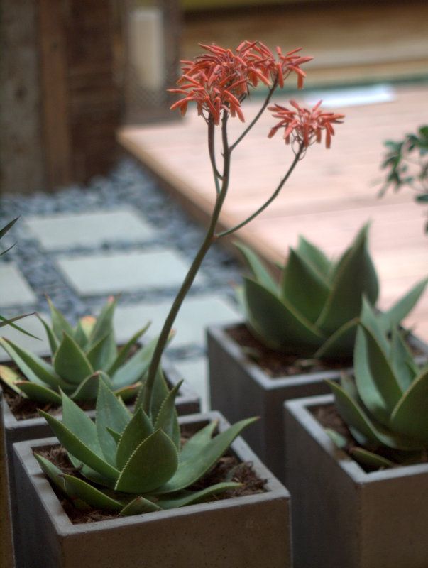
Multiples of blooming Aloe striata in square black planters on pavers edged in river stones
My humble critique? While this show may have stinted on plants, the designers came up with loads of good ideas to fool around with at home.
And, mercifully, there was a welcome absence of over-the-top outdoor kitchens/saunas/fireplaces, etc.
Next year I’m hoping that a better balance can be achieved that accommodates space for plant vendors, good design, and the needs of the stores themselves.

I wish there were shows like that here. Looks like a lot of fun!
Your photos are much better than mine – and your critique is more generous. I was disappointed. I haven’t put much stock in the displays for the last few years but the shortage of plant vendors and interesting potters made me question whether the show is worth the hour drive there and back. I can understand the POV of the surrounding shops but, in my own case, there was so little to hold my interest at the show that I took off, never venturing into any of the surrounding shops (a first for me, I think!). I took my wallet to Rogers instead.
The display gardens were all tasteful. One succulent vendor had a few unusuals. Sad there were so few plant sellers, tho I can appreciate the stores paying $2000 a square foot wanting more customers. Was the Fullerton Green Scene any good? I out-of-town family visiting last weekend and could not go.
Ooh, I love this! I’ve never been to a garden/home show in person (I think the one in Kansas City is all home, few if any plants) but have been loving the posts from the west coast about the fabulous plants at all the shows. I’d love if there was something like this next to the Pottery Barn and Anthropologie in the Johnson county suburbs of KC. They’re all outdoor mall spaces though.
The lack of plant vendors seems to be a huge horrible theme all through the west coast garden shows. So very sad and unfortunate. What can we do, do you think, to change this?
But these display gardens seem like a wonderful departure from the norm. Modern, spare, stylish and not over the top. Every one of the ones you shared had multiple elements that appealed to me. THIS I want more of!…
@Amy, no plant/garden shows? That’s surprising.
@Kris, what a bizarre Catch 22 — we were so glad that South Coast hosted the show, but now this pushback because it’s too much of a good thing.
@Hoov, yes, the Green Scene was mobbed!
@Jennifer, I traveled to San Francisco for years to see their show. How far are you from Philly? thousands of miles, I know 😉
@Loree, how about a Plantlust Plant Fair? I’d love to get something like that going down here, but I have a feeling it’d be easier in the PNW.
The designs are nice here, but driving business into the lifestyle businesses looks to be more a goal than promoting or supporting garden-making.Hopefully designers like Dustin get some business out of it too. Even if you come away with a couple good ideas form events like these it can be worth it. And by the way B&D hasn’t been at SF for a couple of years.I’m back in mail order mode for Lily purchases..
These displays look pretty intriguing to me, with plenty of ideas (if not plentiful plants) to incorporate at home. I’d give it a thumbs up.
Another vote for the uncluttered, thoughtfully edited look. Lots of cool ideas here. I really like the walls/screens/fences: Dustin Gimbel’s blue-green wooden screen, the woven lath, the corrugated siding… [chides self for missing everything over the weekend]